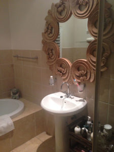
BEFORE
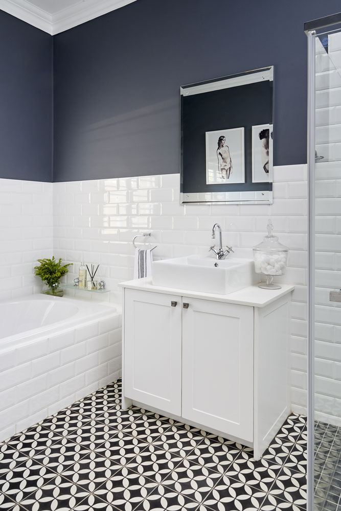
Using a simple monochrome scheme, Jo’burg interior designer Kelly Adami, brought a tired bathroom up to date.
HOW IT WENT FROM DRAB TO FAB
The owners wanted a bathroom that suited their personalities. They asked Kelly to give it a new fun, fresh look. “It’s always great when you have a client with good taste,” says Kelly. “She knew exactly what she wanted. A bold, clean scheme that would make a statement but wouldn’t date.” They gutted the room, but as the layout functioned perfectly, they kept it and just replaced the old sanitaryware with new. “We chose white metro tiles, and only tiled halfway up the walls, which looks more modern. The rest was rhinolited and painted a deep colour for a chic, sophisticated contrast.” Geometric tiles bring it to life.
Now it’s a smart, functional space that suits both the male and female occupants. “As we kept to the original footprint and plumbing points, it was largely a facelift and fairly simple to do,” says Kelly.
A new vanity with storage space keeps surfaces clutter free and is complemented by a bevelled mirror. The metro tiles are from Italtile and the patterned floor tiles from Hadeda.
MORE MAKEOVERS: A cottage kitchen makeover


