Once dreary and disorganised, this study is now a well-functioning, comfortable space to work in
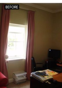
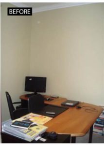
On the plus side, this study in Newlands, Cape Town was situated on the south west side of the house where the light is softer and better for computer work. On the downside, it was full of books and clutter and the L-shaped desk took up most of the floor space. Add uninteresting walls and a bulky easy chair and the result was rather uninspiring, providing no incentive to the family who lives there to get down to that all-important paperwork or homework.
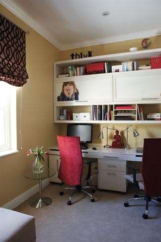
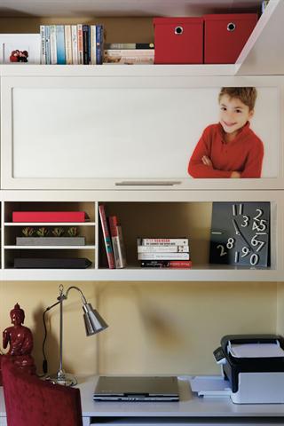
Enter Lulu Ridgway of Lu’nique Interior & Design, an up-and-coming interior designer who has a rigorous eye for detail and a very appealing sense of colour. To take care of the books and clutter she designed a wall unit, made by H.G. Holliday, featuring a work surface, open shelves and cupboards. To personalise the cupboard doors, family photographs were printed onto Perspex by Grosvenor Branding Solutions. The upper shelves were cleverly extended to wrap around the corner adding extra storage and a design feature at the same time. At ground level, the placement of filing cabinets created two separate work stations which prove handy at homework time.
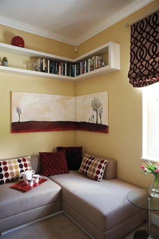
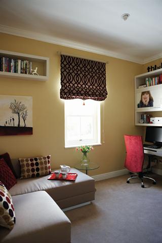
Once the practicalities were taken care of, Lulu turned to making the room inviting and comfortable. She replaced the lacklustre drapes with a Roman blind in an Osborne & Little fabric from Fabric Library and the armchair with a corner bench unit made to her design by Moorgas & Sons. This she covered in a linen look fabric, Success, from Home Fabrics and added scatters in rich reds and greys from Woolworths, Boardmans and Coricraft. A corner painting, specially commissioned from Kirsten Sims, echoes the floating shelves above and a montage of photographs on one wall is a reminder that this is, after all, a family room.

