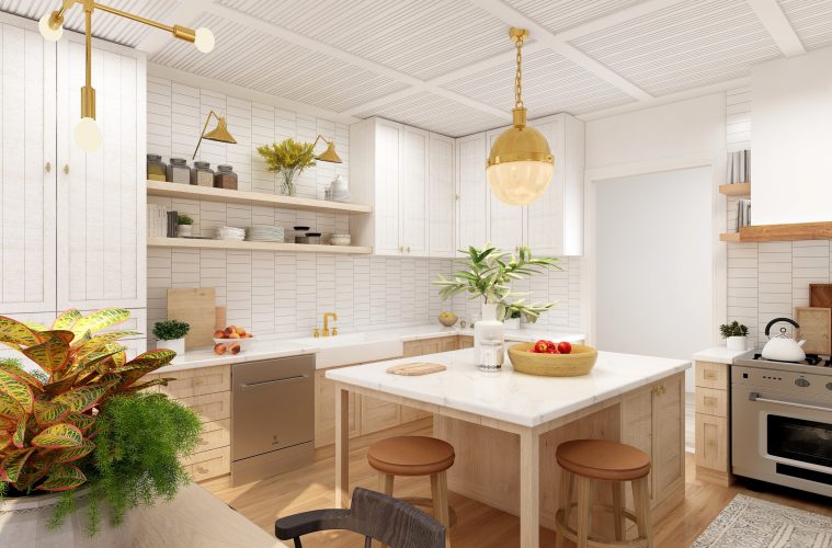
The phrase ‘the kitchen is the heart of the home’ is true for a lot of people. It’s where we come together to cook, to laugh, and to enjoy the social aspects of food. However, it is also one of the trickier rooms to design in our homes.
Balancing function and aesthetics is not always an easy task, leading to a few common mistakes in kitchen design. Make sure you avoid these 7 mistakes to take your kitchen design to the next level.
Poor plug placement
Mikael Cho via Unsplash
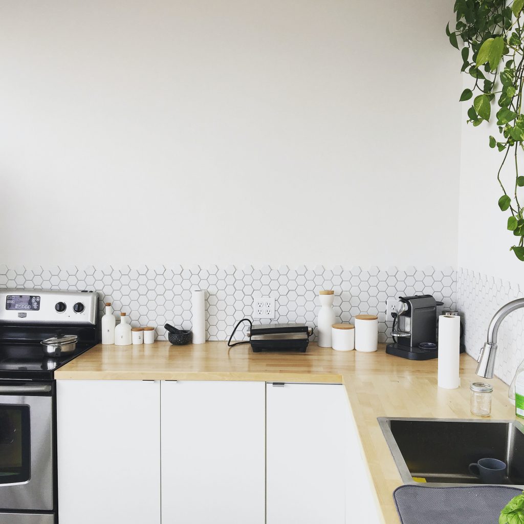
The first mistake comes when first designing your kitchen and it relates to the long list of appliances we find in our kitchens. Consider how many appliances you have in your home that are always plugged in – even ignoring the occasional ones that still need power – and the need for plug points adds up quickly.
If your plug points aren’t placed strategically, you’ll find yourself struggling with cluttered wires all over your countertops or stacks of appliances packed into corners. Make sure you identify the perfect spot for your appliances while designing, adding a plug point close by where possible to make fittings that much easier.
Choosing aesthetics over function
Beazy via Unsplash
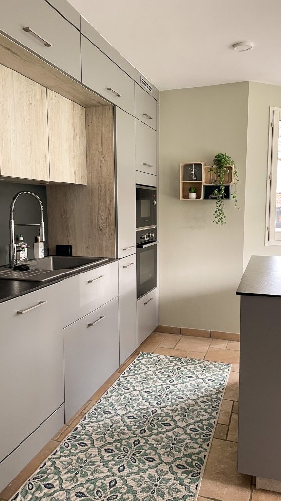
We spend a lot of time in our kitchens, so we understandably want them to look their best. However, that shouldn’t come at the price of practicality. Kitchens are for cooking after all, and you don’t want a kitchen setup that makes things harder than it already is.
Design experts recommend the ‘kitchen work triangle’ for the most functional space. This involves creating a triangular shape in placements between the three most used areas – the fridge, the stove and the sink. Aimed to maximize space and improve workflow, the kitchen work triangle provides a great basis for the rest of your kitchen design.
Cluttering your countertops
Becca Tapert via Unsplash
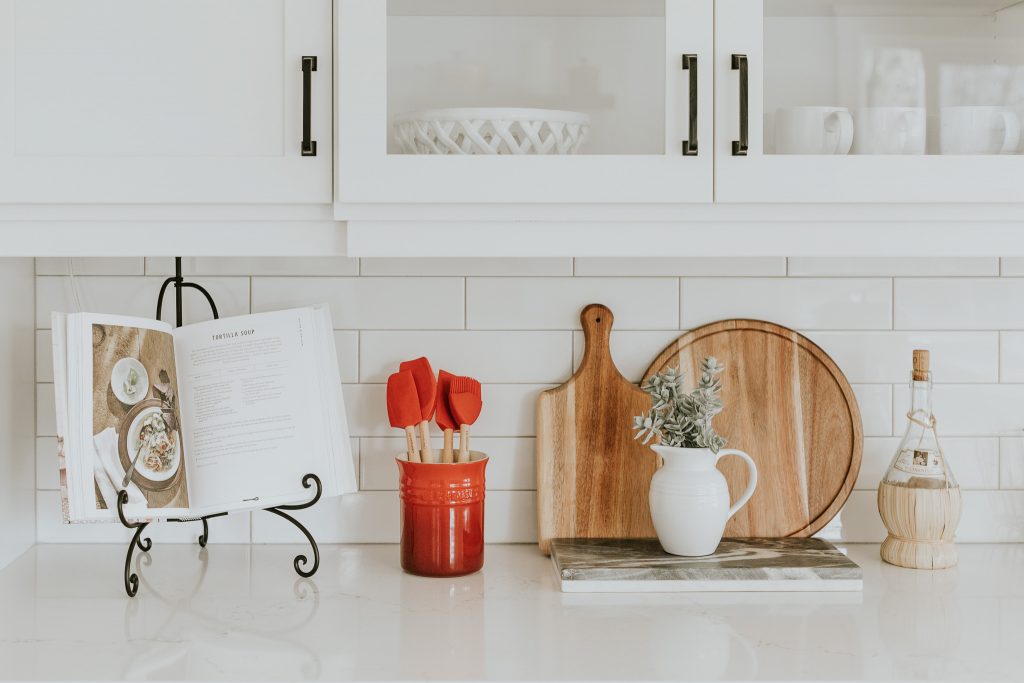
If there is one common mistake almost every homeowner makes at some point – either intentionally or by accident – it is cluttering countertops. Although every room benefits from a touch of decor to improve the space, it can quickly become too much in kitchens.
Every item you place on a countertop that doesn’t need to be there only takes away from the functional space and makes the kitchen feel smaller. Either choose functional items to display, such as a cookbook you’re busy using, or keep the counters clean and let the furnishings speak for themselves.
Dim or poorly placed lighting
Hans Isaacson via Unsplash
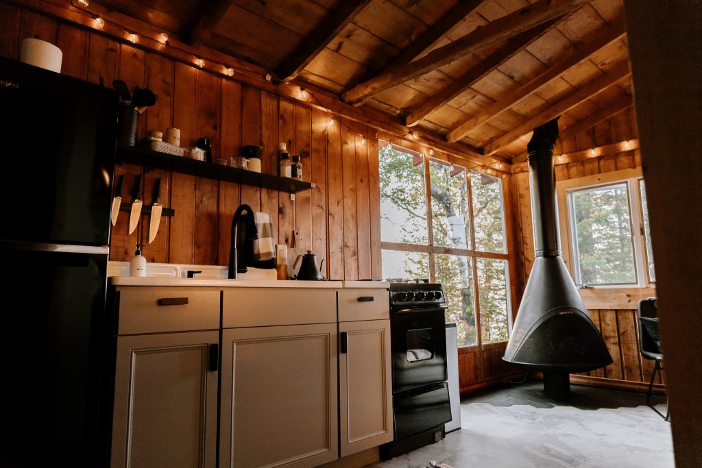
Mood lighting is big at the moment, with people prioritizing dim lamps and calm darker spaces over intense overhead lighting. But, because a kitchen needs to be functional first, you cannot forgo adequate lighting in the space. There is nothing worse than trying to make a meal and not being able to tell whether it is ready or not because it’s too dark inside.
Ensure your lighting illuminates the important areas like the stove well enough to be used at all hours of the day. You can supplement with lamps, but these will only take up valuable counter and floor space, adding to the clutter inherent in kitchens.
Skip the island sink
Simona Sergi via Unsplash
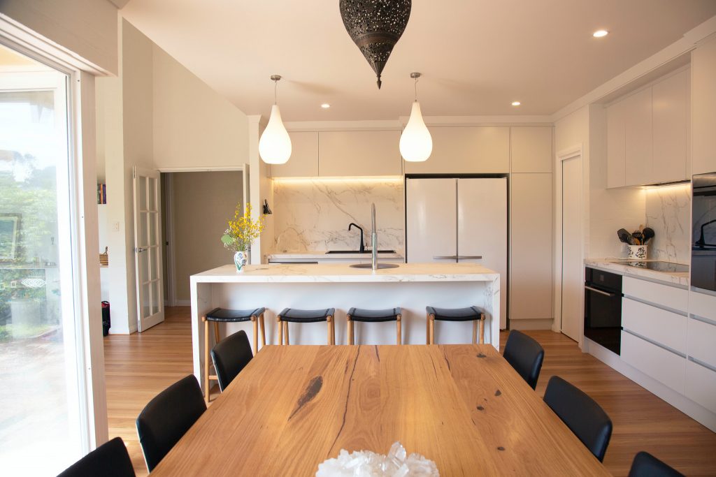
The next tip is a slightly more controversial one, but hear me out: you don’t need a sink in your kitchen island. It may be nice to have the extra sink space and easy access to running water when you need it, but prep sinks are hardly ever necessary in an island.
Without them, you could use the entire island for preparation, serving and even seating when needed. But a sink popped right in the centre greatly limits an island’s functionality. They are even more unnecessary when placed a few steps away from a larger sink that is likely to be used more often. If you’re set on having a prep sink, rather place it on one end of your island so you can maximize the remaining space.
Ignoring vertical space
Dane Deaner via Unsplash
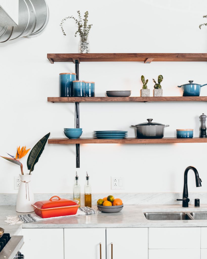
Overhead kitchen cupboards are being used less and less these days, with more people opting for an open and light look over storage space. But that doesn’t mean your walls should remain completely blank. This vertical area is the ideal place to focus your design, using art pieces, shelving, books and plants to tie in with the rest of your home.
If you do need extra cupboard space, try to get your cupboards to reach the ceiling rather than leaving an awkward gap. Not only does this increase storage space, but it also stops dust from piling up on top of the cupboards that is difficult to clean.
Trying trendy backsplashes
Edgar Castrejon via Unsplash
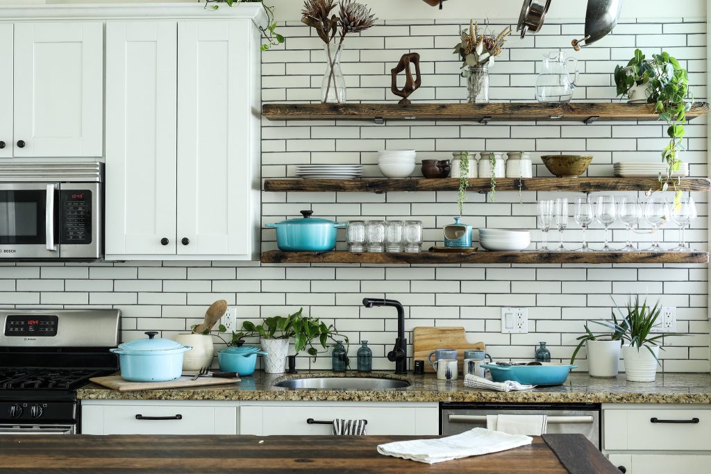
Backsplashes can make or break a kitchen design, depending on what you use. It has the ability to tie the entire room together, add a subtle style that may be missing from other furnishings, or maybe introduce a pop of colour to connect your kitchen with the rest of your home.
Unfortunately, backsplashes are also one kitchen design element that cycles through trends very quickly. Using a currently trendy backsplash that lacks an element of timeless style instantly dates your kitchen. They are also a mission to swop out, so it’s best to choose something more consistent over the trend of the season.
Featured image: Collov Home Design via Unsplash

