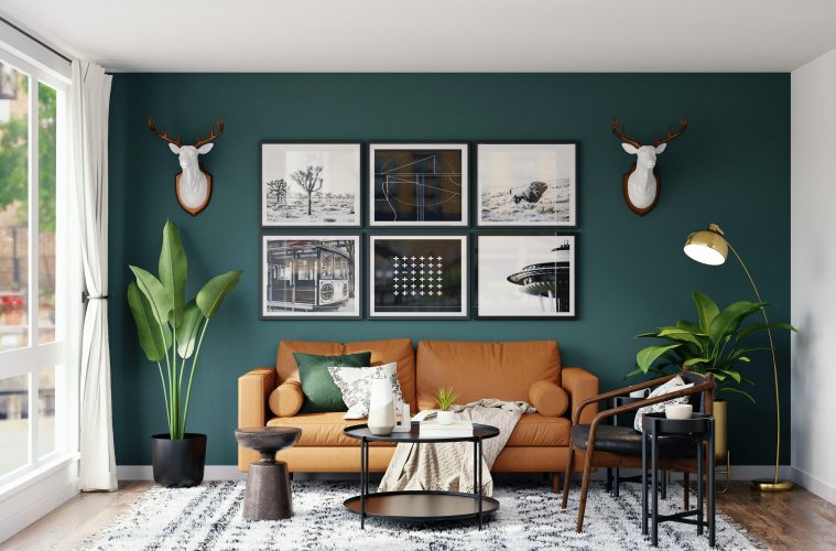
Home decoration has a massive impact on how you perceive your space. Not only does it enhance the look and feel, but also plays a role in expressing your personal taste. Though home decor goes beyond having eye-catching furniture and an appealing aesthetic, there are several fine details that can transform your space with small styling adjustments, placement and design.
Julie Sousa, interior stylist and content creator, shares her decor and design tips on multiple online platforms. We’ve compiled our favourite decor tips that cover everything from dining room table placements to shelving and more.
1. Avoid clutter, follow the rule of thirds
The rule of thirds is a preferred, visually appealing tactic that is used often in decor and styling, but is a rule also found in things like photography and writing.
This rule does not necessarily refer to just having three objects on a surface. You can also layer objects, such as stacking three objects on top of each other. Here is a clip displaying an example of the rule of thirds:
@the_avantgarde #hometips #homedecor #decoratingtips ♬ Purple Hat – SOFI TUKKER
2. How to style a coffee table
Coffee tables can be tricky to style. We’ve got remotes, magazines, coasters and maybe a book or two, which can quickly appear too cluttered or busy. Considering the rule of thirds in your placement, it’s also important for the objects to be in balance with each other in terms of scale.
@the_avantgarde #homedecor #coffeetable #interiorstyling #boston #homeinspo ♬ My House (Challenge Version) – Flo Rida
3. How to style a dining room table
Whether you have a long dining room table or a square-shaped table, there are two important things to consider in the rest of your design – shape and size. Put simply, you want objects that align with the shape of your table. For longer tables, it’s best to organise your objects with a rectangular centre piece or three objects (remembering rule of thirds) placed in a linear fashion.
@the_avantgarde #homedecor #interiordecorating #diningtabledecor #hometips ♬ September – Earth, Wind & Fire
4. Decorative boxes for TV remotes
TV remotes don’t take up much space on the coffee table, but if you’re wanting to neaten things up, why not get a decorative box to place your remotes in? Neutral colours blend well, hiding the storage box, and you can also incorporate the rule of thirds. There is also another bonus – no more losing the remote or finding it stuck under a cushion.
@the_avantgarde Boxes linked in bio under shop my home #homedecor #hometips #decortips #livingroomdecor ♬ Golden – Harry Styles
5. How to make your dining room more interesting
To make your dining room more aesthetically appealing, avoid matching table and chair sets and rather introduce contrasting materials and textures. This provides visual interest rather than having repeated similar colour palettes which can wash out a room.
@the_avantgarde #homedecor #interiordesign #hometips #decortips ♬ Bop – HipHop Beats
6. Scale is key to a spacious appearance
This is a fine detail which can be easy to miss. Once you become familiar with your space and play around with shapes, you will notice how small changes in the placement of furniture or decor can make a room appear much more spacious.
@the_avantgarde #hometips #decortips #homedecor #interiordesign ♬ Forever – Labrinth
7. How to make your shelves more stylish
When it comes to shelving, our first thought is usually to organise our books alongside each other. This often leads to the appearance of clutter or a shelf that looks too busy. Switch up your shelving by stacking your books or placing decorative objects in a simpler way. Sousa gives excellent examples and touches on the importance of measuring your shelving space.
@the_avantgarde #homedecor #decortips #shelfdecor #hometips ♬ Purple Hat – SOFI TUKKER
8. Less matching, more contrasting
When styling your bedrooms, it is tempting to try matching objects and decor. But, to make it more interesting, try matching objects with undertones from the room. This allows for more texture and depth.
@the_avantgarde #homedecor #decortips #hometips #interiordesign101 ♬ Still Don’t Know My Name – Labrinth
9. Improve the layout of a longer living space
The advantage of having a larger living space is that it allows you to incorporate social spaces within the room, rather than just having a room for one function. To make the most of long spaces, try dividing them.
@the_avantgarde #homedecor #hometips #decortips ♬ Purple Hat – SOFI TUKKER
10. How to style a smaller living room space
Small spaces often feel cramped. But the solution is not always to remove more furniture, but rather select furniture better suited to a small space. Furniture items that have larger bases take up more room. Rather opt for open furniture with a simpler design that adds a feeling of lightness.
@the_avantgarde #smallapartment #livingroom #homedecor #hometips ♬ Blue Blood – Heinz Kiessling
Featured image: Spacejoy via Unsplash


