A great design never goes out of style. To prove it, here are three classics that are more popular now than ever before
1. TROMPE L’OEIL EFFECTS

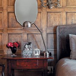
Then: Trompe l’oeil means to ‘trick the eye’ and is an art technique that was first used on walls in France during the Baroque period (from 1600), when skilled painters would create the illusion of moulding or panelling which looked three dimensional.
Now: Today, digital printing allows for similar optical effects to be easily created with wallpaper. The wood panelling in this bedroom (left), designed by interior decorator Lisa Levor, is in fact a fabulous example of trompe l’oeil wallpaper – Andrew Martin’s Regent in Light Oak from Halogen International.
“Brick, stone cladding and leather-look wallpaper is often used to create a feature wall. It’s cheaper than the real thing but gives the same 3D look,” says Claire Douglas of Flair Interiors. Candice dos Santos of The Silk and Cotton Company adds that the bookshelf designs that create the look of a library are very popular.
“Trompe l’oeil wallpapers are typically sold by the roll or by the panel,” explains Claire, “but you can also have custom graphics printed to fit the exact size of your wall; these are usually priced per square metre.”
2. SUBWAY TILES

Then: Subway tiles are so named because they were used in underground train systems abroad when these were built in the late 19th and early 20th centuries. They were chosen because they’re durable and low-maintenance, which also make them a great choice for modern living.
Now: Subway tiles are a fashionable choice for kitchens and bathrooms. They’re available in matt and glossy finishes with either a straight or bevelled edge, and now come in a range of colours as well as the classic white. “Bevelled tiles have a more classical feel, while straight-edged tiles are best for retro-inspired or modern spaces,” says Jasmin Kraneveldt from Bathroom Bizarre.
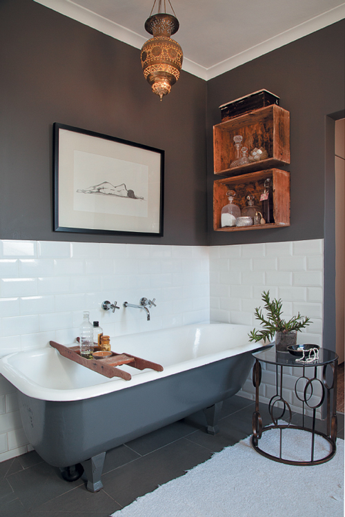
“Laying subway tiles horizontally in an offset or brick-bond pattern (see left) is the most popular option. However, laying them vertically can add a completely different dimension to a space,” adds Amraj Dursan of Italtile.
Choosing the colour of the grout is also an important decision. Interior designer Ché Hooper of Portfolio Design, who designed this bathroom (left), suggests using a grout that’s the same colour as your tiles if you’d like a seamless look, and opting for a grout in a contrasting shade if you’d like to make a feature of your tiles.
3. WINGBACK CHAIRS

Then: The wingback chair was a staple in 17th-century homes. It derives its name from the wings which rise from the arms and join the back of the chair, originally to protect the occupant from draughts.
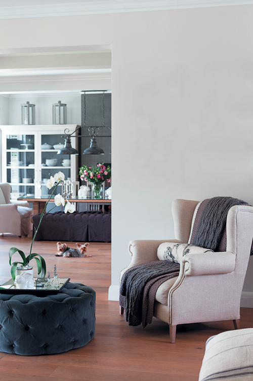
Now: The modern wingback is smaller, simpler and less fussy than the traditional armchair, explains Anton Odendaal of Rochester.
Classic details, like the scroll arms and studs seen in this chair from Block & Chisel Interiors (left), are still popular. “Today piping is often done in a contrasting colour to add visual interest and emphasise the interesting shape of a chair,” he adds.
“Deep-button detailing on the back and rich leather upholstery are timeless touches that remain fashionable,” concludes Theo van der Hoven, Sales Executive at Alpine Lounge and La-Z-Boy.

