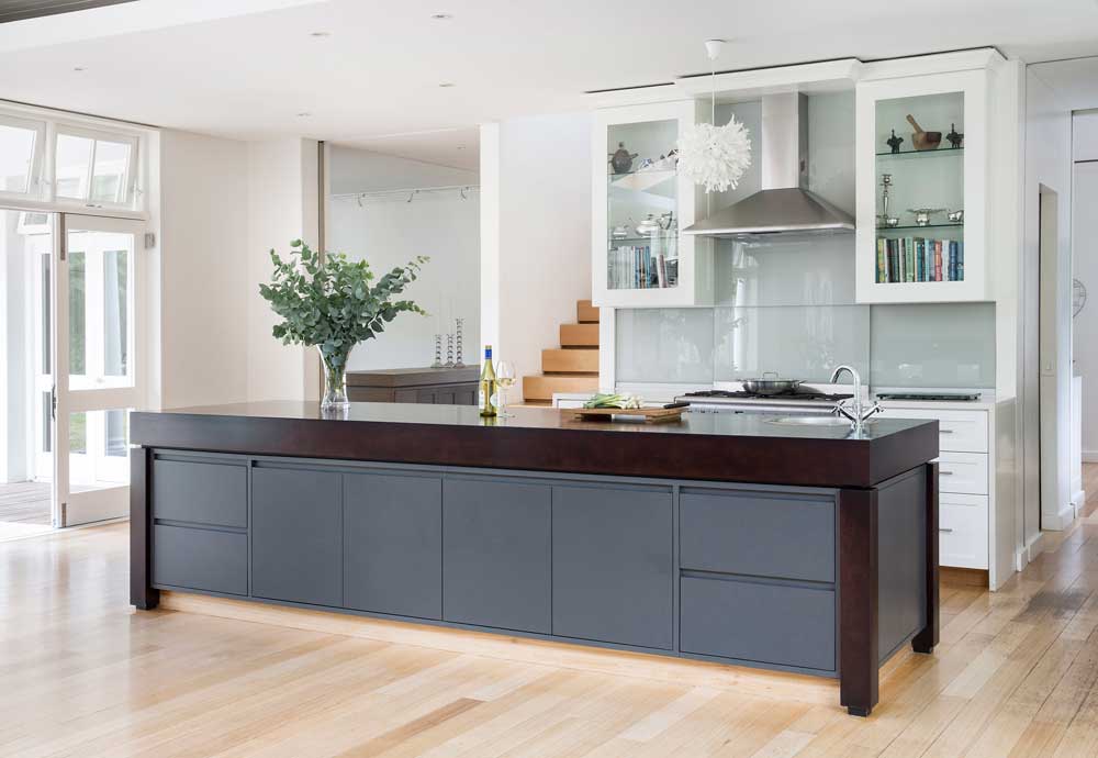
Be inspired by how these homeowners designed their kitchens to reflect their personalities and suit their lifestyles.
RUSTIC CHARM
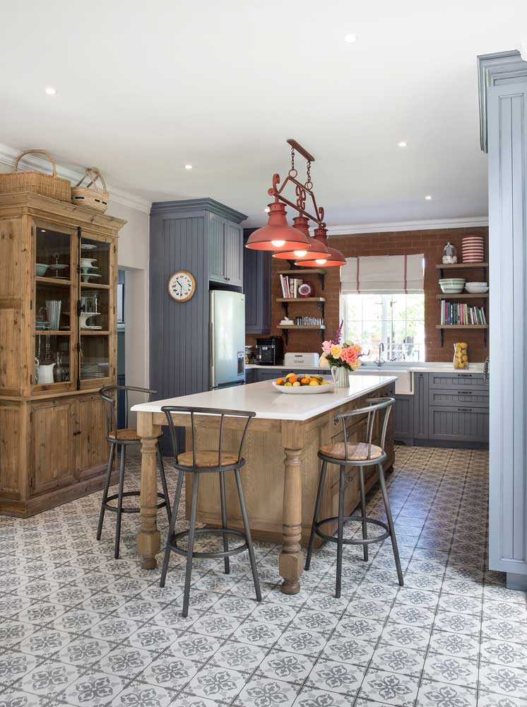
As the kitchen in their Stellenbosch home was small and cramped, Caren and Daniel Naude asked Louise Ellis of “Loft I Love” to give it a makeover and bring in a rustic country look.
READ MORE: Clever tricks to maximise space in small kitchens
The room was gutted and walls were broken down to open the kitchen to the living areas and create more space. To ensure it was warm and inviting and create a focal point, one wall was clad in red brick. To make a feature of the floor, it was laid with Spanish-style tiles. “We chose a mix of duck egg blue cabinets with classical cornices, an oak island with a Caesarstone top and a freestanding glass-fronted cabinet so that the kitchen looks furnished rather than fitted,” explains Louise.
The most practical features: “The island. In the evenings my husband and two children sit at the end and keep me company while I’m cooking. The floor-to-ceiling cupboards on the right, which serve as a pantry, are also a favourite. They’re fitted with shallow shelves so everything is within sight and reach,” says Caren.
Tips: “Nothing creates a warm country look like wood, so always include it in this style of kitchen,” advises Louise. “Use a favourite item like the light fitting as a starting point and then design around it. Don’t overlook the floor as a way to make a statement, too.”
A NEW CLASSIC
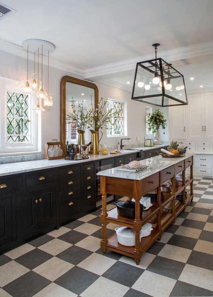
As this long, narrow kitchen looked dated, the owner asked Monique Mann of Patina Interiors and Kaiser Joinery to assist her in planning a new look and layout.
READ MORE: Top tips for designing your dream kitchen
The kitchen was gutted and replaced with classic cabinetry designed by Monique in black and white with brass handles. “We built the iLVE stove and cooker hood into the cabinetry as well as the fridge and wine cooler so that they’re unobtrusive,” explains Monique. “On the window side, we kept to waist-height cabinets so that we could retain the windows, which make the room light, and left them uncurtained for a more modern look.” While the marble countertops and splashback are a nod to the age of the house, they’re also on-trend at the moment.
Most practical features: “The soft touch cabinetry and the different zones make the kitchen a dream to work in,” says the owner.
Tips: “Including accessories like this gilt-framed mirror and glass decanters make the kitchen more of a living area and less of a purely functional space,” says Monique.
IN BLACK AND WHITE
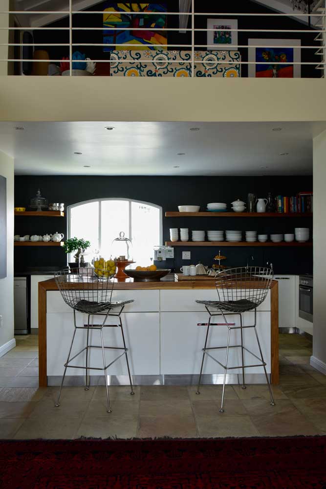
Tucked away under a mezzanine level and cut off from the living areas, the kitchen in this house in Oaklands, Jo’burg, was dark and cramped.
To add much needed space, the owners embarked on extensive renovations opening up the kitchen to the living areas and installing an elegant arched window. The wall mounted cabinets were replaced with floating shelves, which make the confined space appear larger. Making up for the lost storage space is an island with cabinets and a timber surface to sit at. To link the kitchen to the decor of the living areas, the owners consulted Lyrene Zimmerman of The Furniture Guild who suggested a dark wall colour. “The large window lets in lots of light so we could paint the walls black, which really makes the white kitchenware pop,” she explains.
READ MORE: 7 Easy kitchen updates
Most practical features: The concealed storage in the island for large pots and casseroles, as well as the inlaid handles which don’t catch on clothing.
Tips: “If you want to add colour or drama to a kitchen, do this with a painted feature wall,” advises Lyrene. “It’s not permanent so you can change it when you want a different look.”
OPEN HOUSE
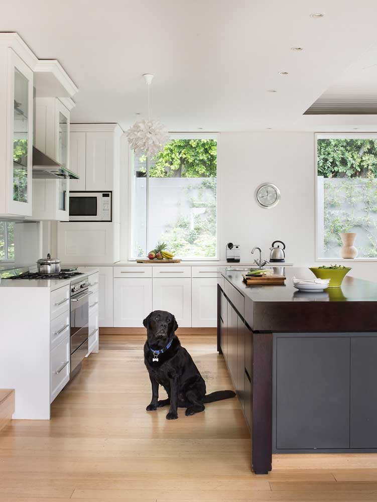
When Debbie and Robert Coombe decided to rebuild their home in Kenilworth, Cape Town, they asked architect Bert Pepler to design them a spacious, contemporary kitchen with classic elements that would form part of the dining area.
Bert anchored the kitchen with a large, contemporary two-toned island, which he contrasted with a classic-style, two-way fireplace that separates the kitchen and dining area from the living room. The classic look is emphasised by the cornices that crown the kitchen cabinets. The lighting was kept simple with down lights and pendant fittings. “To link all the areas, we laid Indonesian teak floors and opted for a neutral palette throughout,” says Debbie.
The most practical feature: “The splashback behind the stove. It’s actually opaque glass sliding doors, which hide all the spices and kitchen utensils stored in a recessed cabinet above the stove. It keeps the kitchen looking neat and tidy.”
Tips: “In an open-plan kitchen like this one, always include a separate scullery to hide the mess, especially if you entertain here,” advises Bert Pepler.

