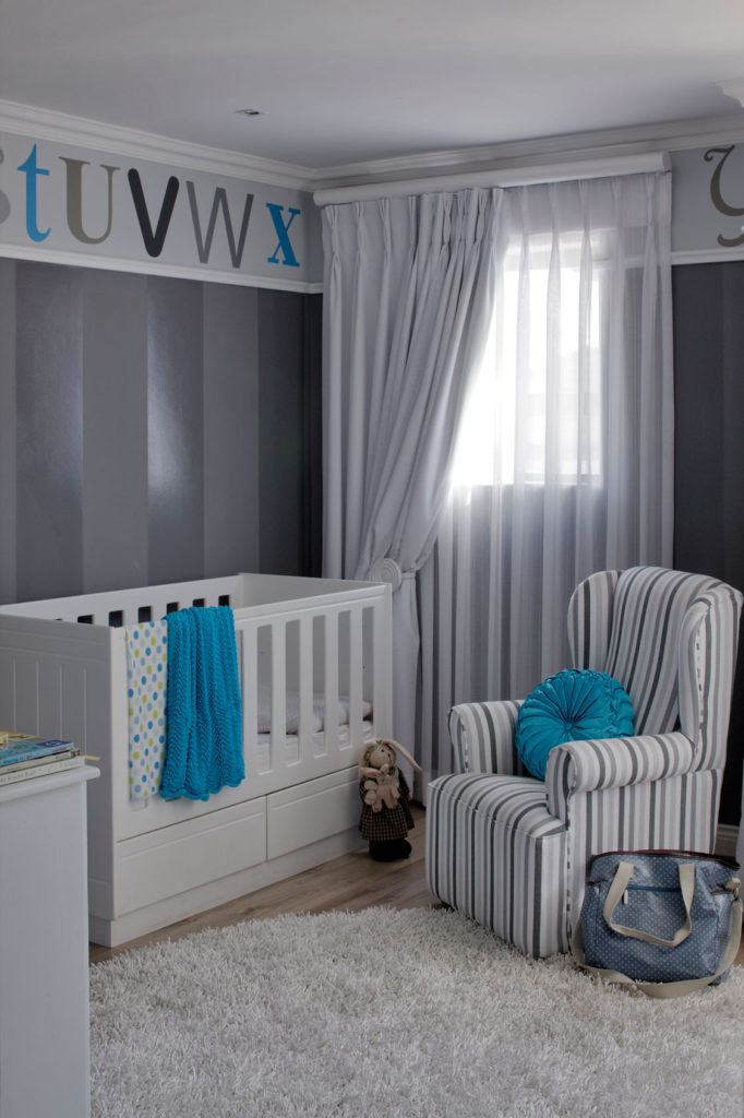
When Blouberg mom Sam Pienaar was pregnant, she had no idea whether she was expecting a boy or a girl. “I told interior designer Cheryl Herweg of Changing Spaces that I didn’t want a typical colourful baby room, but a calm, stylish space that would still be appropriate and cute as a nursery”
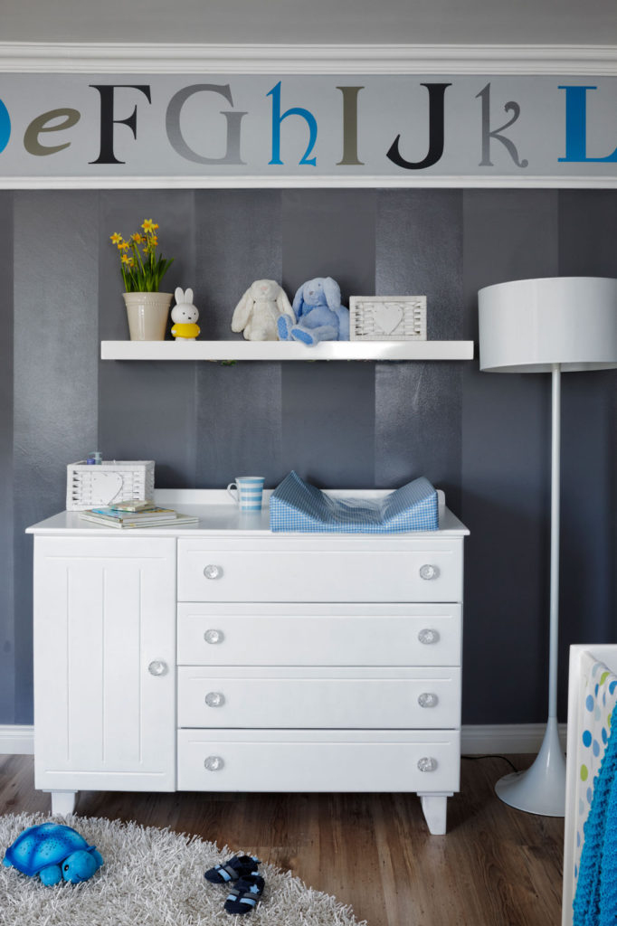
Cheryl’s solution was a grey and white palette where splashes of either blue or pink could be added after Sam gave birth. “I’m not a fan of blue- or pink-themed baby rooms as they tend to date quickly. This nursery is rather compact, so I had wall stripes painted in Plascon Expressions, colour Neutral, and Earthcote, colour Candlestick, to add depth without making the decor too busy. The neutral alphabet decals from WallArt Studios were mounted before Ross’s arrival; I simply omitted a few letters and ordered them in blue on the day Ross was born and had them mounted before Sam returned from hospital,” says Cheryl.

While Sam loves the serenity of the palette, she feels that the room is very practical too. “I wanted a light and airy feel during the day, so Cheryl combined sheer and block-out curtains, which give us complete darkness when Ross needs to sleep. The layout is also brilliant. Having a changing station with plenty of storage to the left of the cot with a rocking chair right next to it is extremely functional,” she says.

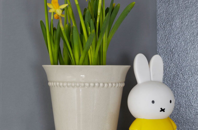
The floor lamp is from K. Light Import and the striped mug and planter are from Woolworths.


