As far as beautiful bathrooms go, this compact space was anything but. “The original bathroom in the guest suite was functional but dreary and I wanted to create a welcoming space for my family when they visit,” recalls homeowner Linda Eedes of Cape Town

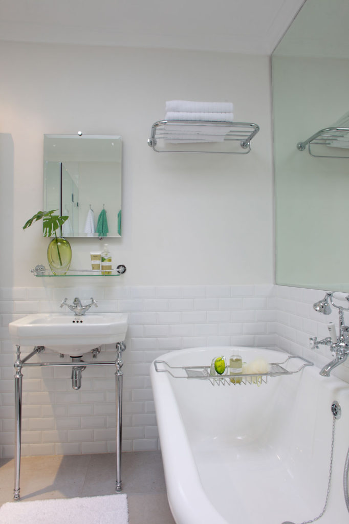
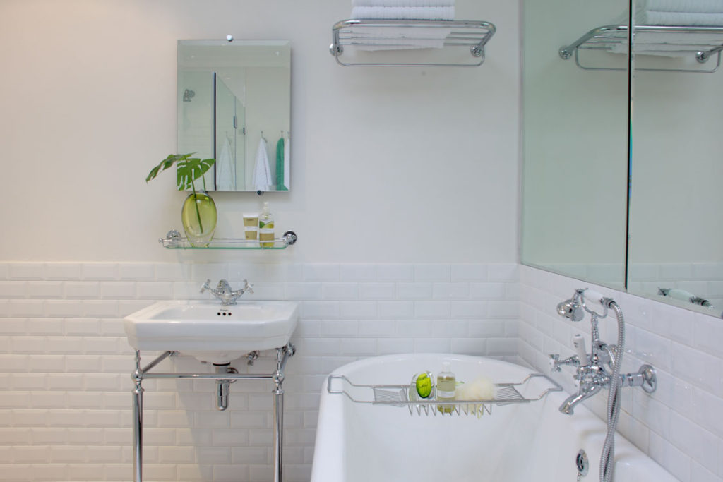
With a freestanding bath you need a surface for soaps and toiletries and this bath caddy provided the solution.
“I had in mind something contemporary and light, yet classic too.”

The open space beneath the basin makes the bathroom appear more open and airy.
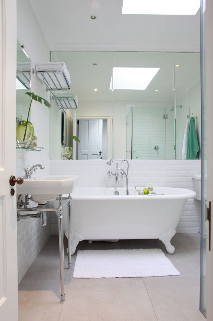
Interior decorator Gillian Goodwin of 89 Interior Design began updating the small bathroom by replacing the older, tired finishes and retiling the walls in glossy white subway tiles. “The original ball and claw bath was badly stained and in poor condition, but I loved that it echoed the history of our house, which was built in 1903. So we replaced it with a new version from Victorian Bathrooms. The rest of the fittings were chosen to continue the vintage theme but with a contemporary interpretation,” explains Linda.

The crisp white subway tiles combined with the classic fittings and mirrored wall transformed this functional space into a glamorous and spacious bathroom.
The freestanding basin reveals more floor space, as do the floating shelves and wall hooks. “The shower remained in the same corner but we expanded the enclosure and replaced the glass. Linda liked the idea of cladding the wall behind the bath with mirror to trick the eye into thinking the bathroom is bigger. The floor tiles, from Florstore OnTrend, mimic the colour of the adjoining bedroom carpet giving a seamless connection between the two rooms,” explains Gillian who also suggested the skylight, which floods the room with light.
