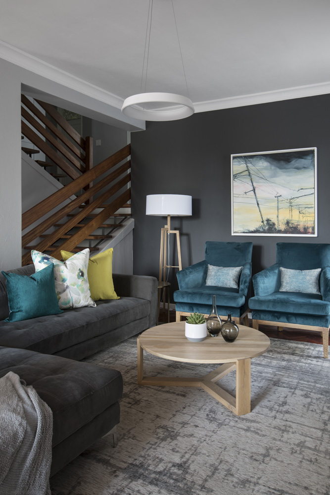
If there’s one characteristic all successful renovators share, it’s the ability to spot potential in the unlikely.
YOU’LL ALSO LIKE: A small apartment gets a fresh new look

BEFORE
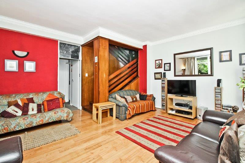
From the outside, this apartment block in Illovo, Jo’burg, had very little architectural merit. When this couple went inside and viewed the apartment, the panelled walls and unusual layout were also rather off-putting.
AFTER
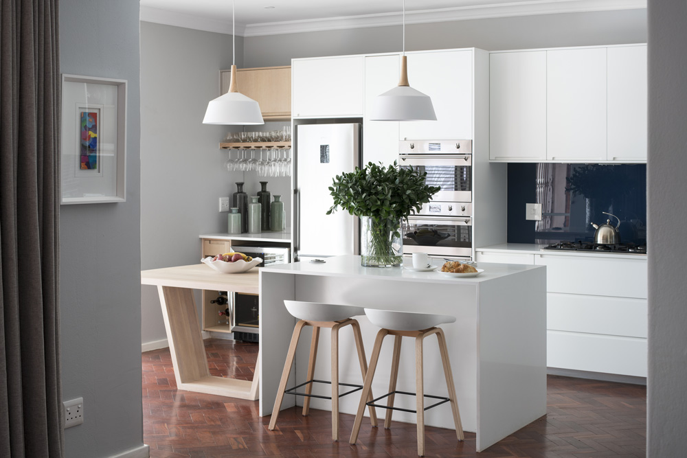
But they both had the knowledge and vision to see that it could be turned into a stylish city home. “While we liked the size of the unit, the garden was one of the biggest selling points. The apartment also ticked our boxes with regard to location and a plus is that it’s just a block away from my office,” says owner and senior architectural technologist, Mamisa Sokhela.
KEEP READING: Savvy Jo’burg renovation
BEFORE
As his partner had worked with interior decorator Julie Peatling previously on the update of a one-bedroom apartment, she asked Julie to assist them on their renovation journey. “With his experience in the architectural world, Mamisa knew exactly how to restructure the floor plan. I was there to advise on fixtures and finishes and to undertake the decorating,” explains Julie.
YOU’LL LOVE: House plan for a modern Sandton duplex
AFTER
HOW THEY DID IT
The first thing they decided on was the function of each level. “When we’re at home, we spend most of our time in the living room and kitchen, and having these rooms on different levels didn’t work for us,” explains Mamisa. As it has access to the garden, it made more sense to have the living room and kitchen on the ground level. “The bedroom/study became the kitchen and the scullery replaced the bathroom. “This worked well as the plumbing was already in position. Removing the wall between the two rooms brought in more natural light and opened up the view to the garden,” he comments.
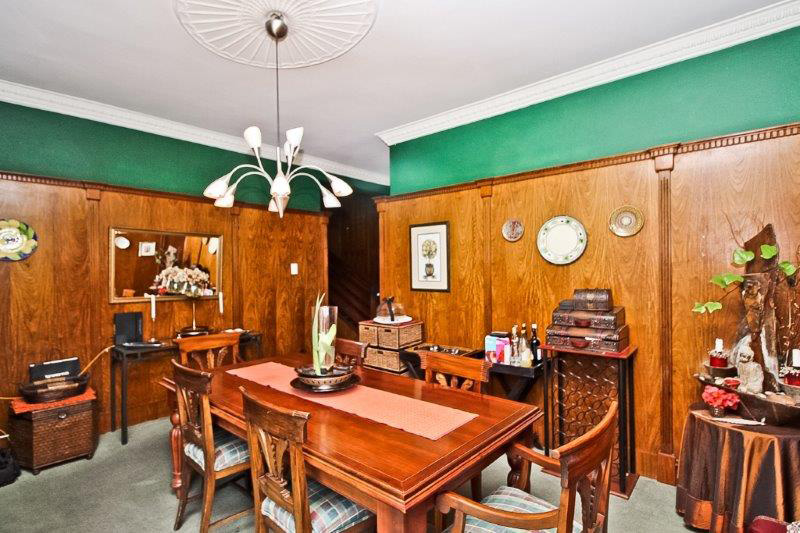
BEFORE
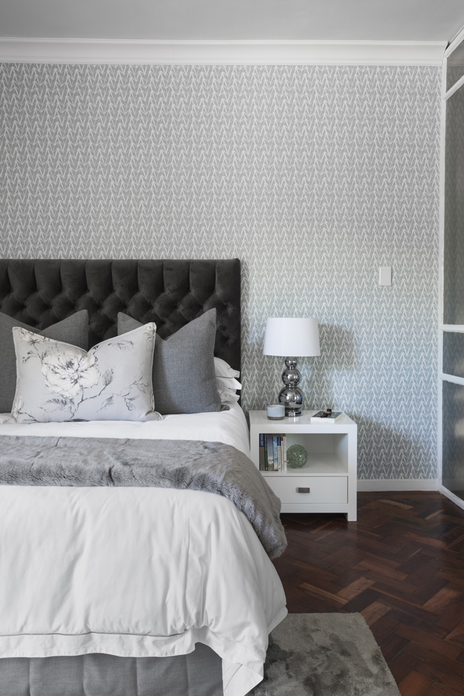
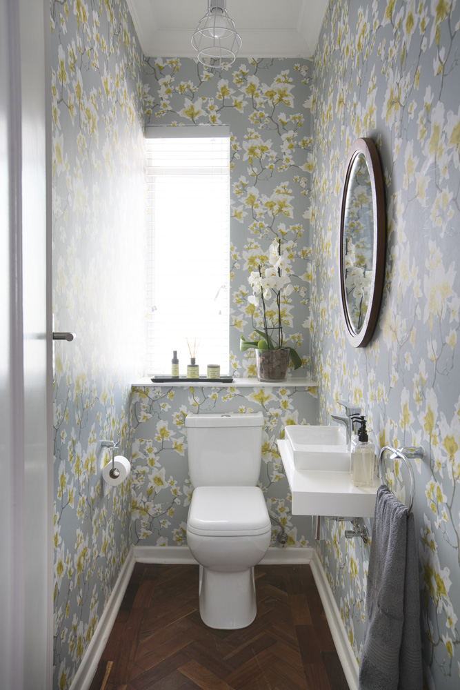
The entry level in the centre, which originally housed the kitchen and dining room, became the new master bedroom with its own bathroom. The guest toilet on this level was refurbished but the upper floor was left as is.
The next step was to strip the interiors. All the flooring and panelling was removed. “We retained the solid wood staircase and balustrade as they made a striking design element and simply sanded and sealed them,” says Mamisa.

Forming an elegant base to the new decor is salvaged parquet flooring laid in a herringbone pattern. “We chose this for its romantic charm and it’s a nod to the era of the building. We also felt it would complement the existing stairs and balustrade,” explains Mamisa.
“It set the tone for the whole apartment and was laid throughout, except in the bathrooms,” says Julie. All the electrical points were replaced and Julie sourced new light fittings for all the rooms.

Julie’s brief requested interiors that would suit both partners. “From the previous project, I knew that her style was quite feminine, but this time I knew I had to bring in more masculine elements,” she recalls. “They wanted a mix of solid fabrics and finishes with pops of colour and prints in the living areas, and preferred something more neutral but stylish in the main bedroom.”
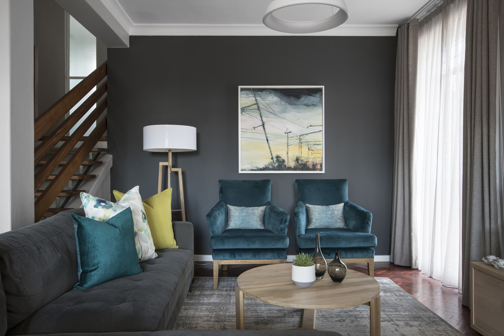
The interiors were designed from scratch as all they brought from their previous home was the grey corner suite and raw wood coffee table. Julie felt that a teal shade would be a perfect foil for the grey sofa and had two chairs custom-made and upholstered in velvet in this colour. “I punched it up a bit by introducing chartreuse scatter cushions.”
She also painted one wall in the living room dark charcoal. “My clients initially weren’t keen on this, but I’m pleased they trusted me as I think it adds an element of drama to the room, and now they love it!”
READ MORE: 6 ways to give your dining room pizzazz

Enhancing the big city vibe is the slick kitchen designed by Mamisa and a kitchen specialist. Extending from the island is an angular wooden table for dining, although at present the owners prefer the bar stool seating. “In the one corner, I suggested they establish a coffee station,” recalls Julie, “but as neither of them drink coffee, they turned it into a mini bar with storage space for glasses and a wine fridge.”
Another aspect that Julie had to consider was that the apartment is on a busy thoroughfare. “As the two bedrooms on the top floor overlook the road, I lined the curtains with block out and acoustic lining to cut out the light, muffle sound and also added sheer curtaining for privacy.”
“Even though we were involved in every step of the project, Julie’s stunning job far exceeded our expectations. We love the colours and the way they work together and how different each bedroom is,” says Mamisa.

